Dulux’s 10 Most Popular House Painting Colours
v
Let’s get started.
 Dulux 10 Most Popular House Painting Colours
1. Olive Sprig (DLX1125-4)
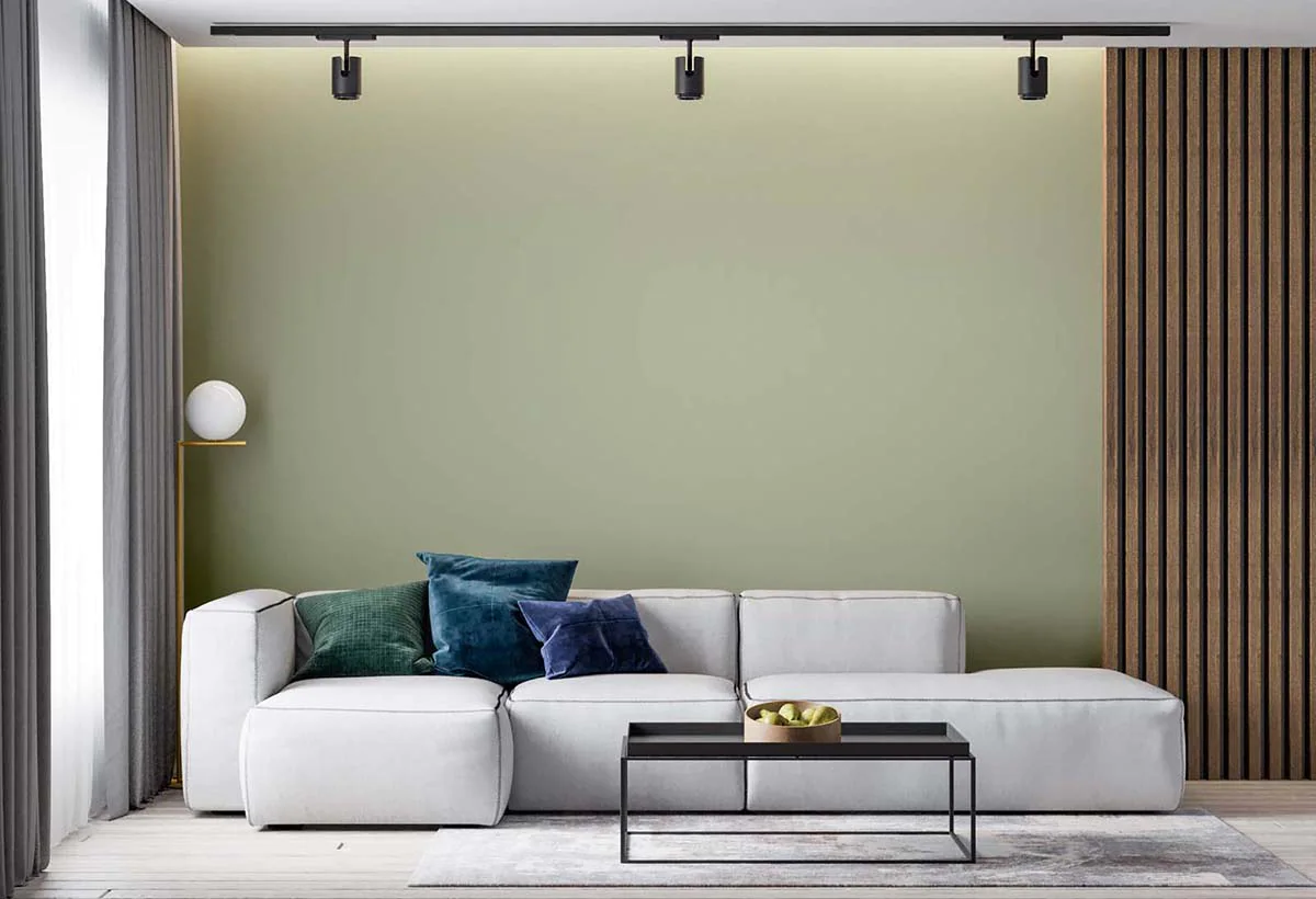
‘Olive Sprig’ has been given the accolade of ‘Colour of the Year’ in 2023…and it’s not without good reason.
This light and mellow olive colour is an excellent choice that you can pick for painting your house. It can act an as elegant and minimalist backdrop for your wooden furniture and pop out amazingly from behind white-coloured fixtures and decoration pieces.
Olive Sprig is neither too dark nor too light. It hits the balance just right, and this is what makes it an excellent choice for bedrooms, living rooms and kitchens alike.
You can pair it with white, beige or green to create an excellent combination of matching shades.
2. Imagine (DLX1094-6)
The Imagine is part of the 2023 Introspective Paint Colour Trend by Dulux. This murky brown can look right at home in living rooms, bedrooms and kitchens along with a swamp green colour combination, such as the Lucky (DLX1118-7) or something on the lighter side like the Edamame (DLX1030-4).
Match the Imagine paint colour with a white ceiling and some light marbled/tiled floors, and you can create a sophisticated and aesthetic look for your home.
3. Yellow Coneflower (DLX1209-5)
The Yellow Coneflower is yet another excellent paint colour that you can choose for your home in 2023. This candy-crayon textured yellow paint can go hand-in-hand with light shades (like Dulux’s Winter Breath, Candlelit Beige, or Atrium White) to create a nice and contrasting combination that can look excellent in small and cozy spaces like living rooms, studies and drawing rooms.
With the Yellow Coneflower, you can also go for the old artistic single-wall painting job for your bedrooms i.e., colouring three sides of the walls pure white and one side with the vivid yellow.
4. Burnt Red (DLX1188-7)

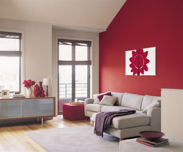
Like the Yellow Coneflower, the Burnt Red also features a vivid candy-ish texture. The Burnt Red colour can act as an aesthetic backdrop for living rooms and drawing rooms, and it can pop out elegantly from behind knick-knacks and wooden decoration pieces.
The Burnt Red can look great with light and floaty blue shades, like the Dresden Dream. If you want to paint your rooms in this colour, be sure to leave the ceiling (and the floor) light and white. The Burnt Red is a little rich, and it can make the room look smaller if it’s applied all around.
5. Tea Time (DLX1054-4)
If there’s anything like a ‘tea room’ in your house, the Tea Time paint is what you need to colour it.
This deep pink shade can look great with matching pink furniture or some minimalist white stuff. But, it’s not the tone you want to try out in a room full of differently coloured objects and fitments.
That’s why the Tea Time paint is excellent for small spaces – where there’s not a lot of chance for you to go wrong with the colour combos.
6. Lucky (DLX1118-7)
The Lucky paint colour features a deep swamp green shade. This paint can look excellent in small spaces and for adding colourful touches to existing paint jobs.
In other words, while the Lucky is not a very suitable choice for doing whole rooms, it can be a great way to complement lighter paint shades and add vibrancy in an otherwise dull setting.
When it comes to the Lucky colour, you should take it like sugar. It’s nice and sweet in small quantities, but too much of it can make things distasteful.
7. Coral Silk (DLX1195-5)
The Coral Silk paint is a peachy blend of salmon and cream shades. It’s not too bright nor too shallow. It has just the right amount of vividness, which makes it suitable for drawing rooms, kitchens, living rooms and bedrooms.
The look of the Coral Silk paint can be enhanced and complemented by other pink shades offered by Dulux such as River Rouge and Paris Pink. You can also match it with some of the good old versatile white to create an overall minimalistic appearance.
8. Pine Whisper (DLX1134-4)
Like Coral Silk, the Pine Whisper paint also has a light and balanced richness. It’s not breezy enough to make the room look empty, nor is it dense enough to make it look crowded instead.
Pine Whisper can be artistically matched with white ceiling and tiled floors. Owing to the resulting contrast, it is not very suitable to be used in rooms with hardwood floors.
9. Mirabella (DLX1176-6)
Purple is the favourite of many, but there aren’t a lot of ways in which you can introduce it to your house’s paint job. Some shades can be a bit bright while some can go a bit dim. This is where the Mirabella steps in.
The Mirabella paint colour has a floaty lavender shade that can be used to add artistic touches and inlays to small nooks and crannies. It can also be used to colour whole walls, but you have to be very specific about matching it with light colours so that it does not make the place look full and stuffy.
10. Silver Service (DLX1004-4)
Wrapping up our list, we have the Silver Service paint.
Thanks to the light and shallow shade of this paint, it can be used in all sorts of places in your home whether it’s bedrooms, bathrooms, kitchens or living rooms. It can also be matched with complimenting shades of peach, light pink or beige to create aesthetic combinations.
Conclusion
And there you have it.
These were some of the best Dulux paint colours that you can try out in 2023. If you’re smart with the combinations, you can have your home looking vibrant and lively in no time.
You can get in touch with paint colour consultants to work out the best combinations for your rooms.
Aireno is the all-in-one renovation experience. Get an instant quote for your renovation project using our quoting wizard and our award-winning team will guide you through a streamlined process on our project dashboard.
Renovation smart with Aireno. Get an instant house painting renovation quote now.


